
Conducting a conference, a seminar, a master class or a festival – for these tasks, landing page is almost a perfect online format. The promotional page perfectly cope with what is needed for a one-time event: quickly attract the visitor's attention, briefly and clearly present the most important information and bring to the target action – registration or purchase of tickets. How should a modern and effective page for the event look like?
The main requirements for the landing page for the event
- Only the most important. The event page should in no case be overwhelmed with information. The main idea is to make it easy to find the key information needed for the user: time, venue, list of speakers, program, cost, etc.
- Visualization. Most visitors do not read, but rather scan the landing pages, searching for the parts they need. It is worth helping them with this: minimum text, more photos and videos.
- Divided into blocks. Different semantic parts of the page are better to split vertically. It will be difficult for the user to immediately figure out what is it all about, if he will see the accumulation of elements horizontally within the same screen, especially text.
- Mobile friendliness. The client must see correctly displayed and working elements, opening your page from any device. It is important to test landing page both on different types of devices, and in various popular browsers.
- Considering the interests of the target audience. When designing a landing page, it is important to take into account the event's main audience. The pages of a children's holiday, a festival for young people or a solid business meeting will vary greatly from one another in design.
What should necessarily be on the page?
1. Key information about the event (first screen)
The first few seconds of a visitor's contact with a page of the event are the most important ones. Definitely at this moment a person decides: has she found the needed information, or it is possible to leave the site.
- What? The name of the event, its slogan or key message, the logo. It does not require long descriptions: preferably only one short catchy phrase that gives the user a sense of what to expect from the event.
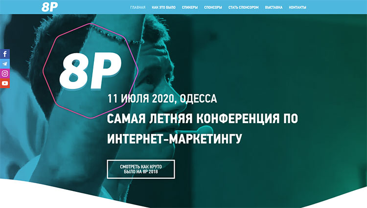
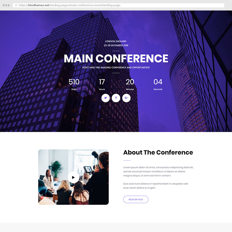
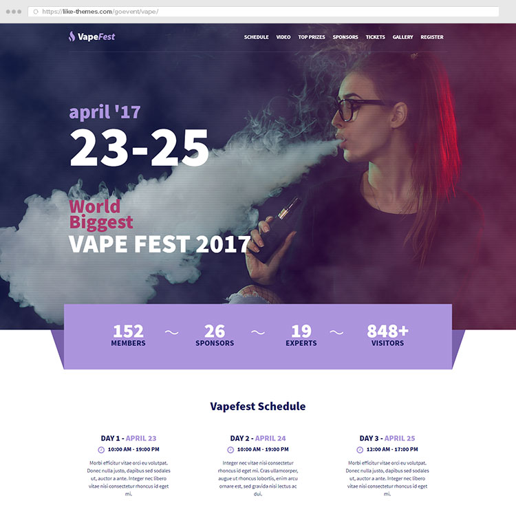
An example of the first screen of landing page of the conference: you can see the name of the logo, a short slogan, date and place, social networks buttons, and a link to a video report from the previous event.
- Where? Location. At the top of the page it is not necessary to give the exact address – it is often enough to designate a city or an area, for example, for events with lots of locations or open-air festivals. If the event is going to be held online, be sure to include this.
- When? Time of the event. It is usually enough to specify a date (or a date range if the event lasts several days). The exact start time can be included in the event program if it is provided.
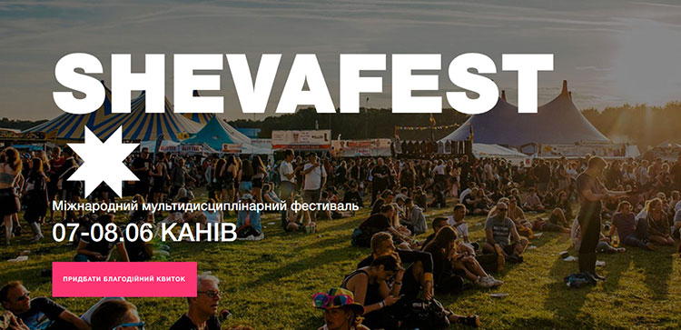
The first screening of the ShevaFest Festival, developed by Arto Web Agency: only the most important information.
- Call-to-action (CTA) button. Not every visitor will want to scroll the page to the bottom of the search form for registration. Someone will get enough information on the first screen, because many people may be aware of the event and open the page only for buying the tickets. Therefore, for the convenience of visitors it is worth adding a CTA button in the first block. The button should redirect immediately to the registration procedure.
- Cost of participation. Price information can be placed at the top of the page too. However, in many cases, it is better not to do this: the numbers can scare a user if they seem too big. Place the price in the top box if it is objectively low and can attract a client, and it is clearly defined and practically unchanged. In other cases (for example, when the cost of participation depends on many factors) it is better to place this information below so that the visitor will see it already after getting to know about all the benefits of your event.
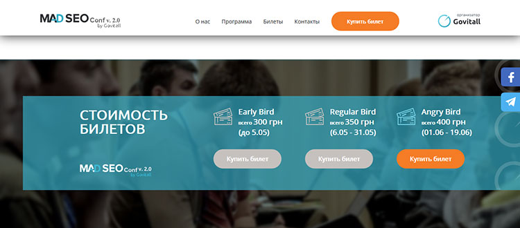
Information about the payment of this SEO conference is placed closer to the bottom of the page and is divided by terms in order to stimulate booking. The first screen shows only the price range.
Do yo want to develop landing page for your event?
Request a calculation of the price of the landing page development and consultation of our experts by clicking the button below.
2. Who holds the event?
- Participants. Closer to the top of the page it is better to place the key, most famous speakers or heads-up artists who will perform at the event. For example, it may be a dynamic slider of three photos with short information about each participant.
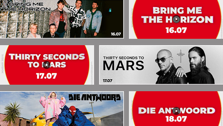
Posters of headliners on the page of the U-Park festival. Each image is also accompanied by a small artist video presentation.
- Event organizers. This information should be listed a bit lower, because it is usually not so important for a visitor. However, if the name of the company and the names of the organizers are "in the public eye" of the target audience, it may well interest visitors.
- Partners. Usually, information about partners is better to place at the bottom of the page. Remember that excess text content is undesirable: a list of sponsors can be presented, for example, in the form of company logos.
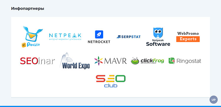
A compact section with partners on the landing page of the NaZapad conference. Each logo is also a link to the partner website.
- Social networks buttons. It is impossible to imagine the modern world without Facebook pages, Instagram or a Youtube channel. Where to place the clickable links depends on your goals. So, if you actively conduct social networks, report important news there and definitely want the interested users to subscribe them – place the buttons in the first block, the site's header or secure it at the edge of the screen (examples can be seen in the screenshots above). If accounts in social networks do not play such an important role for you and are rarely updated, it is better to place them at the bottom of the page. In any case, it is not necessary to make an extra focus on the buttons so that they do not distract from the main content.
- Contact information for feedback. It can be placed in a separate block or in the footer of the page, but it should be there: in case of registration problems or any questions about the measure, clients need to be able to contact you. Moreover, you can separately add a special telephone number and a mail for potential partners: it will help to separate the cooperation offers from the flow of visitors.
3. Event program
In this landing page section, as opposed to the first screen, you can place as much detail as possible about the event, which visitors should know: what and where will take place at a certain time during each of the days, who will perform, etc. But still, it is advisable not to overdo the text. The program should be structured, capacious and understandable.
If many structural blocks are planned, then a good way to make them more compact is to make the program interactive. For example, creating a landing page for Bouquet Kyiv Stage, we depicted the days of the festival as a ribbon. Clicking on an date displays a detailed program of this day (screenshot below).
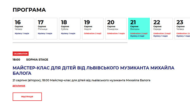
The interactive program of the Bouquet Kyiv Stage festival on the event page, developed by our agency.
4. How to get there?
This section is especially important for festivals with lots of locations. To orient in the venues, plan a route around the city and do everything in time – an interactive map with markers will help this user.
However, even if the event has only one location it should still be marked on the map. Also, in this section it is desirable to briefly describe how to get to the event. This is especially important if guests will come from other cities, or a building has an ambiguous, not immediately noticeable entrance. Otherwise, on the day of the event, you will have to accept a lot of calls and explain the road.
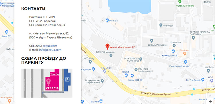
On the CEE Electronics Show page, a map is combined with contact information that helps to save space.
5. Registration form
The last, but not the least item in the list is mandatory. All CTA-buttons should direct the user to this page. The same form can be placed either at the bottom of the page, or in a separate pop-up element.
Several things to consider:
- the form should not be too cumbersome. Ask the customer only for the most necessary information. You can easily lose customers because of the excess fields in the form. By the way, too long registration form is one of the most common mistakes on landing pages;
- provide all possible payment options that are acceptable for your event. For example, a subscription for all days, a ticket for only one day or 2-3 days in a row;
- connect the online payment system to the page. The phrase "Send money to the PrivatBank Card" does not inspire customers in 2019;
- if the event is free, but registration is still required, then make a noticeable notice;
- be sure to enable email notifications after filling in the form. The visitor must be sure of the success of his purchase / booking and not worry about his money;
- do not forget about the "Privacy Policy" if you ask for the personal information from clients: the user should click "tick" to agree to this. Separately describe how you plan to use customer's information: are you going to save it in a database, or transfer it to third parties, etc. It's not necessary to create a new page for it: you can pop up the privacy information or upload it to the site in a PDF file.
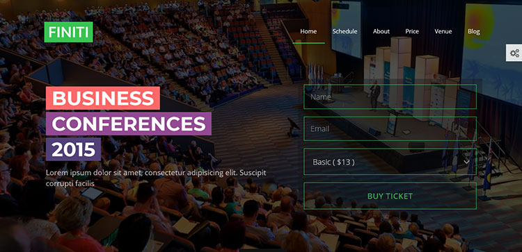
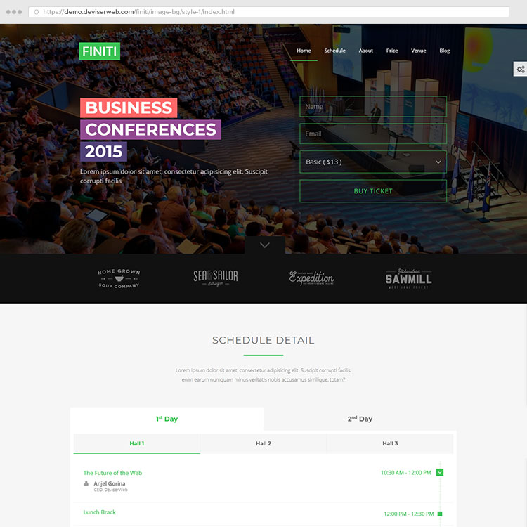
Example of the most comprehensive registration form for the conference from the Finiti Template for Wordpress
Additional items
The landing page of the event can be supplemented by a number of other blocks. They are not obligatory, but it will help you to get interest and increase your conversion.
- Photo / video report of past events. If the event is not held for the first time, show people how it was before. High-quality, bright photos and videos will awaken the interest for your event.
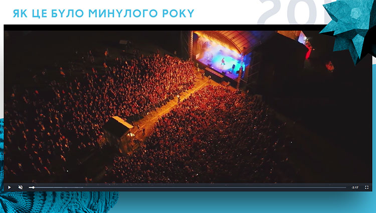
A video from the previous Atlas Weekend right on the festival page
- "Why should you choose us?" If your conference, lecture, or exhibition have a number of undeniable advantages over competitors that you can highlight – feel free to create such a section. However, remember the danger of overloading with text.
- Timer before the event. It can both draw attention and push a slow client to order tickets.
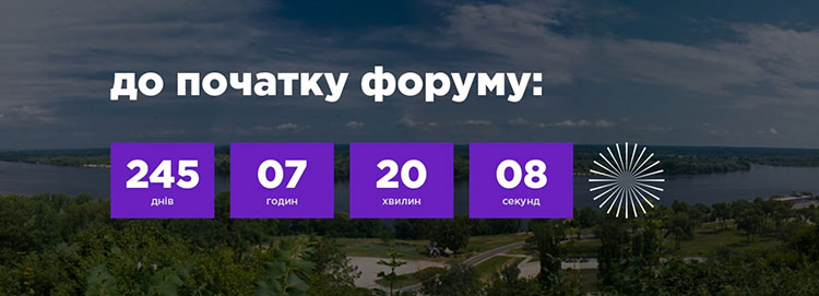
Timer on the promotional page of the International Economic Forum Ukrainian ID, which was edited by our agency
- A bit of humor. The organizer has to decide: to apply the event in a completely serious and strict key, or to allow yourself some funny insertions. Both ways have the right for life, but remember that humor should be appropriate. Only in this case, it really attracts, and do not distract the visitor.
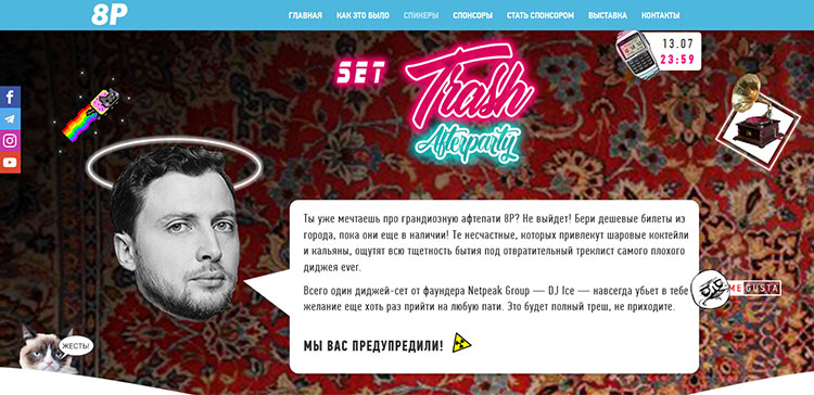
The conference is a serious thing, but nobody forbids make up some humorous description for an after party.
- Visitors' feedback. This section is relevant if the event has already been held before. Expanded reviews with photos of authors will help raise the trust of the organizers. An additional confidence signal could be the linking of feedback to social network accounts.
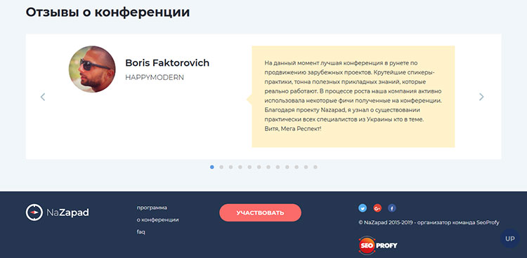
Review section on the NaZapad conference page. The footer is also visible, where the social network buttons and links to the organizer's site are located
- CTA buttons in different blocks. Landing page will be more effective if it will regularly remind the user of the ability to do a targeted action at various stages of the "scanning". However, it's important to keep balance: the number of the buttons should be exactly as that they do not interrupt viewing and do not irritate the visitor.
- Using PDFs. This format greatly helps to place not only the privacy policy, but also any additional information that you do not want to load on the main page. In this case, PDF files do not require any layout costs, and allow you to stay within the single page format.
So, let's give an example of how the optimal structure of the page for the event may look like:
- first screen: key, most important event information;
- list of speakers / performances / artists;
- program of the event;
- information about the organizers;
- address of venue, map, list of locations;
- detailed price information;
- registration form;
- a list of partners / sponsors;
- contact details for communication with the organizers.
Of course, this list is tentative: you can modify the order of the elements or add it according to your priorities and preferences.
But if you do not want to burden yourself with unnecessary worries to create a landing page for your event, you can contact us: Arto Web Agency is always glad to help you! Landing page development is one of our specialities. We will consider your goals and create an individual, modern promotional page. Fill in the form by clicking on the button below and we will definitely process your request.


